2026 Leading Wall Colors: Terracotta and Clay Pink
Terracotta and clay pink stand out for their ability to create grounded yet refined interiors. These shades connect spaces to natural materials and maintain visual interest without overwhelming a room. They suit both residential and commercial applications.
The following sections explain the characteristics of each color, methods for application at different budget levels, and strategies for integration with other tones.
Characteristics of the Palette
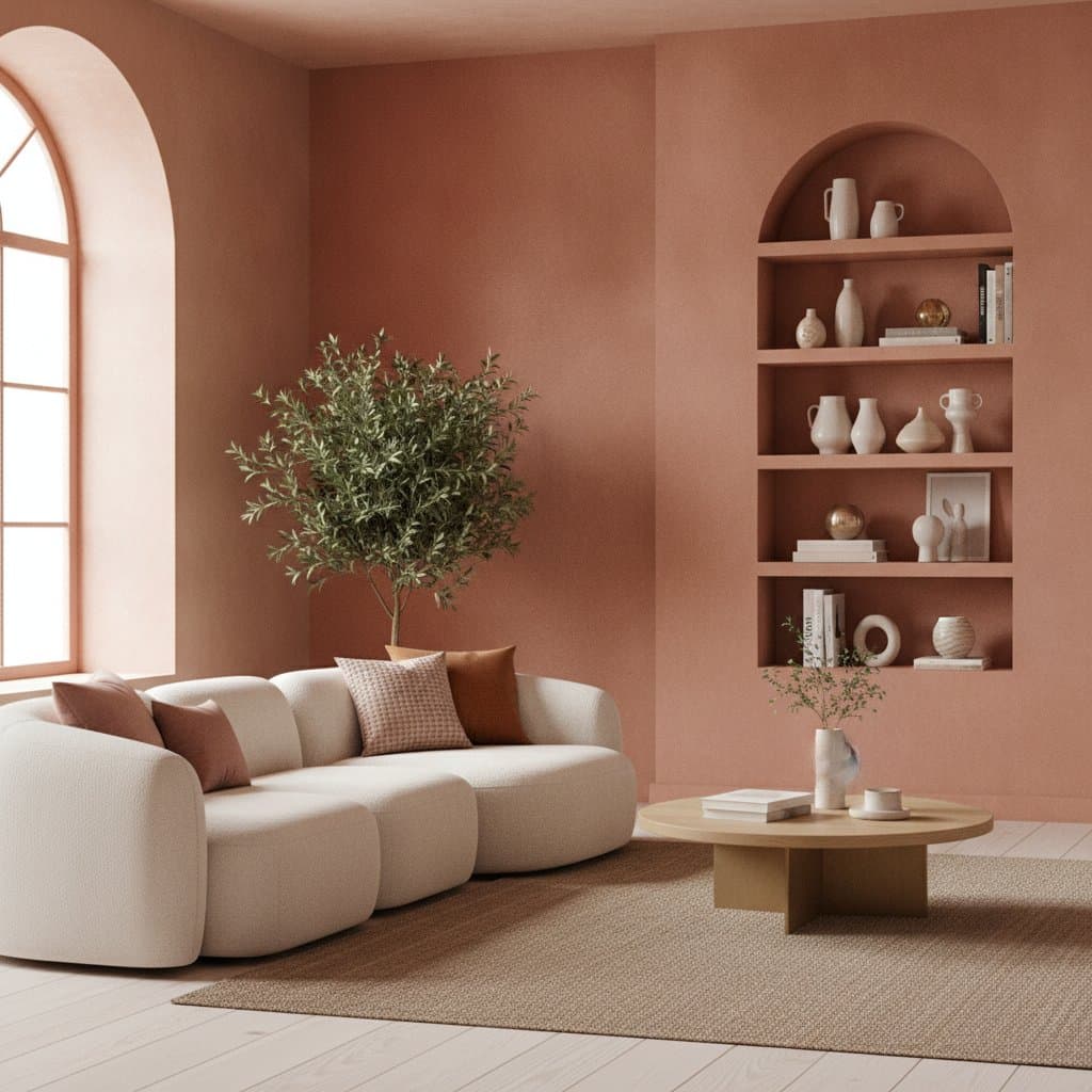
Terracotta provides depth similar to fired clay or weathered brick. This quality produces a sense of stability that supports mature design schemes. Clay pink offers a softer luminosity with brown undertones that prevent sweetness and maintain elegance.
Both colors conceal minor surface marks more effectively than lighter shades. They retain their appearance in matte or satin finishes and develop character over time.
Application Methods by Budget Level
Quality results depend on surface preparation, appropriate product selection, and consistent technique rather than high expenditure alone.
Budget-Conscious Projects
Select a quality interior latex or acrylic matte paint. Prime surfaces before application to achieve accurate color representation. Apply two thin coats with a microfiber roller to promote even coverage and faster drying times.
Mid-Range Projects
Choose washable matte or eggshell finishes for increased durability. Introduce subtle depth by mixing a glaze medium with small amounts of the base color and applying it with a rag. This step creates surface movement without additional cost.
Premium Projects
Use mineral or lime-based paints that allow breathability and develop a natural patina. Engage a painter experienced in layering and burnishing techniques. The finished surface resembles hand-tinted plaster.
Compatible Color Pairings
These hues integrate well with a range of supporting tones. Maintain one dominant color and treat others as accents to preserve visual balance.
- Neutral options such as soft white, beige, sand, taupe, and greige create calm foundations.
- Cooler tones including sage green, mineral blue, and charcoal gray provide contrast while tempering warmth.
- Stronger accents such as deep teal, aubergine, mustard, and burnt orange heighten the earthen quality when used sparingly.
Lighting Considerations
Wall color appearance changes with light source. Terracotta responds well to warm LED or Edison bulbs. Clay pink reveals its nuance under natural daylight. Indirect lighting prevents harsh shadows that reduce color depth.
When preparing spaces for photography, position bounce lights or reflective surfaces such as mirrors to distribute illumination evenly. This approach produces natural, consistent results on camera.
Selection Criteria for Paint Products
Evaluate products based on three practical factors. Confirm low-VOC or water-based formulations for indoor air quality. Verify that two coats deliver sufficient coverage. Ensure batch consistency when covering multiple surfaces or coordinating across locations.
Smaller manufacturers sometimes supply clay-based paints pre-tinted in these ranges. These options dry to a velvety texture suitable for both residential and commercial work.
Exterior Applications
Terracotta suits stucco or brick surfaces for a Mediterranean appearance. Clay pink works effectively on entry doors when paired with stone or wood elements. Matte black hardware provides clean definition. Always select exterior-grade formulas with UV protection to maintain color stability.
Execution Steps for Professional Outcomes
Clean and repair walls thoroughly before painting. Fill holes and sand surfaces to create a smooth base. Apply a tinted primer matched to the final color. Cut in edges with a high-quality angled brush, then roll in sections while maintaining a wet edge. Assess the color under multiple lighting conditions before completing the final coat.