Why Lavender and Peach Lead the 2026 Color Shift
Lavender and peach redefine color trends for 2026 through a measured balance of calm and warmth. These hues support both personal comfort and professional presentation across interiors, branding, and product design. Their versatility stems from soft saturation that adapts to varied lighting and materials.
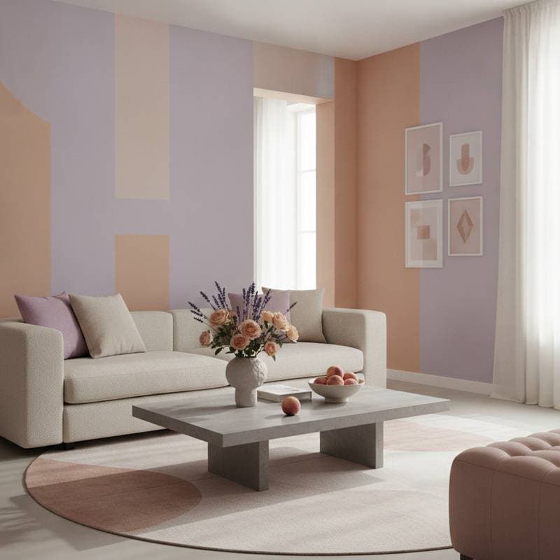
Design Flexibility Across Styles
Lavender and peach integrate into multiple aesthetics because they accept matte, satin, or textured finishes without visual conflict. In minimal settings they provide subtle depth. In layered rooms they harmonize with wood, metal, and natural fibers.
Low Budget Updates
- Apply soft lavender to one wall and maintain white trim for clean separation.
- Introduce peach through pillows or a single ceramic accent.
- Refinish a side table in dusty peach using chalk paint for quick renewal.
Mid Range Improvements
Refinish kitchen cabinets in a lavender gray tone. Select brass or matte black hardware to anchor the palette. Swap curtains for linen in a light peach wash to soften daylight.
Higher Investment Applications
Specify lavender velvet upholstery for a focal chair. Select terrazzo with blush and lilac inclusions for counter surfaces. Install glass pendants tinted to echo both colors for cohesive evening illumination.
Applications Beyond Painted Surfaces
Cabinetry and Built Ins
Paint millwork in muted lavender and back it with peach patterned wallpaper. Reverse the pairing by using peach cabinetry with lavender pulls for unexpected contrast.
Textiles and Accessories
Layer lavender cushions against a peach throw on a neutral sofa. Add one abstract piece that contains both tones to unify the arrangement.
Exterior Details
Paint a front door lavender and frame it with white trim. Place peach planters planted with lavender to create visual rhythm visible from the street.
Strategic Use in Commercial Settings
Retail environments benefit when lavender appears in fitting rooms to reduce visual fatigue. Peach accents near merchandise draw attention without aggressive contrast. Hospitality settings convey care through lavender linens or peach table linens that read as clean and considered.
Branding materials gain approachability when a lavender logo pairs with peach typography. The combination signals modernity paired with approachability across digital and physical touchpoints.
Execution Practices for Consistent Results
- Clean and sand all surfaces before application to promote adhesion.
- Apply a white or tinted primer to control undertone shift in both colors.
- Choose matte for living areas and satin for moisture prone zones.
- Roll paint in overlapping W patterns with a microfiber cover to minimize texture.
- Evaluate samples under morning, afternoon, and evening light before final commitment.
Extending the Palette Over Time
Add cool silver or pale blue elements when a quieter atmosphere is desired. Introduce terracotta or gold when additional warmth becomes preferable. Deep plum or rust provides contrast while preserving overall harmony.
Practical Selection Guidelines
Test multiple lavender and peach samples adjacent to existing trim under natural light. Limit bold application to one primary surface to maintain visual weight. Combine vintage peach ceramics with contemporary lavender artwork to achieve a collected appearance. Apply a protective clear coat on high touch areas to preserve color integrity.
Spaces finished in these tones deliver an immediate sense of ease upon entry. The palette supports daily function while remaining adaptable to future adjustments.


