Pantone 2025 Mocha Mousse: Real Paint Color Matches
Every year a fresh color receives attention. This year the focus rests on Pantone Mocha Mousse. The shade blends taupe and cocoa to create a warm neutral that suits many interiors. It provides balance without appearing flat and adapts to varied lighting conditions.
Why Mocha Mousse Works Everywhere
Mocha Mousse occupies the space between taupe and cocoa. Its undertones remain neutral enough to pair with crisp whites or deep charcoals. Designers often select it as an anchor for layered neutral schemes or as a backdrop for bold artwork.
The color performs consistently under studio lighting. It registers as a soft light brown on camera and flatters skin tones in living rooms, bedrooms, and offices. Subtle beige and chocolate undertones prevent the hue from shifting orange or gray as light changes.
Real Paint Matches You Can Buy
Several commercial lines offer close equivalents. Each match listed below was evaluated under natural light, LED light, and camera conditions.
Sherwin-Williams offers Utterly Beige (SW 6080) as a near match with a faint pink cast in certain conditions. Accessible Beige (SW 7036) supplies a deeper option within the same family.
Benjamin Moore provides Brandon Beige (977) as a close equivalent that remains slightly softer. Smokey Taupe (983) delivers a more saturated result while staying within the same tonal range.
Behr lists Toasty Gray (N320-2) in the appropriate tonal family. Sueded Brown (M250-3) adds depth for projects that require stronger presence.
Valspar carries Perfect Taupe (4003-2A) as a balanced selection that coordinates with warm whites and olive greens. PPG offers Toasty Grey (PPG1024-3) as a slightly cooler alternative suited to rooms with strong southern exposure.
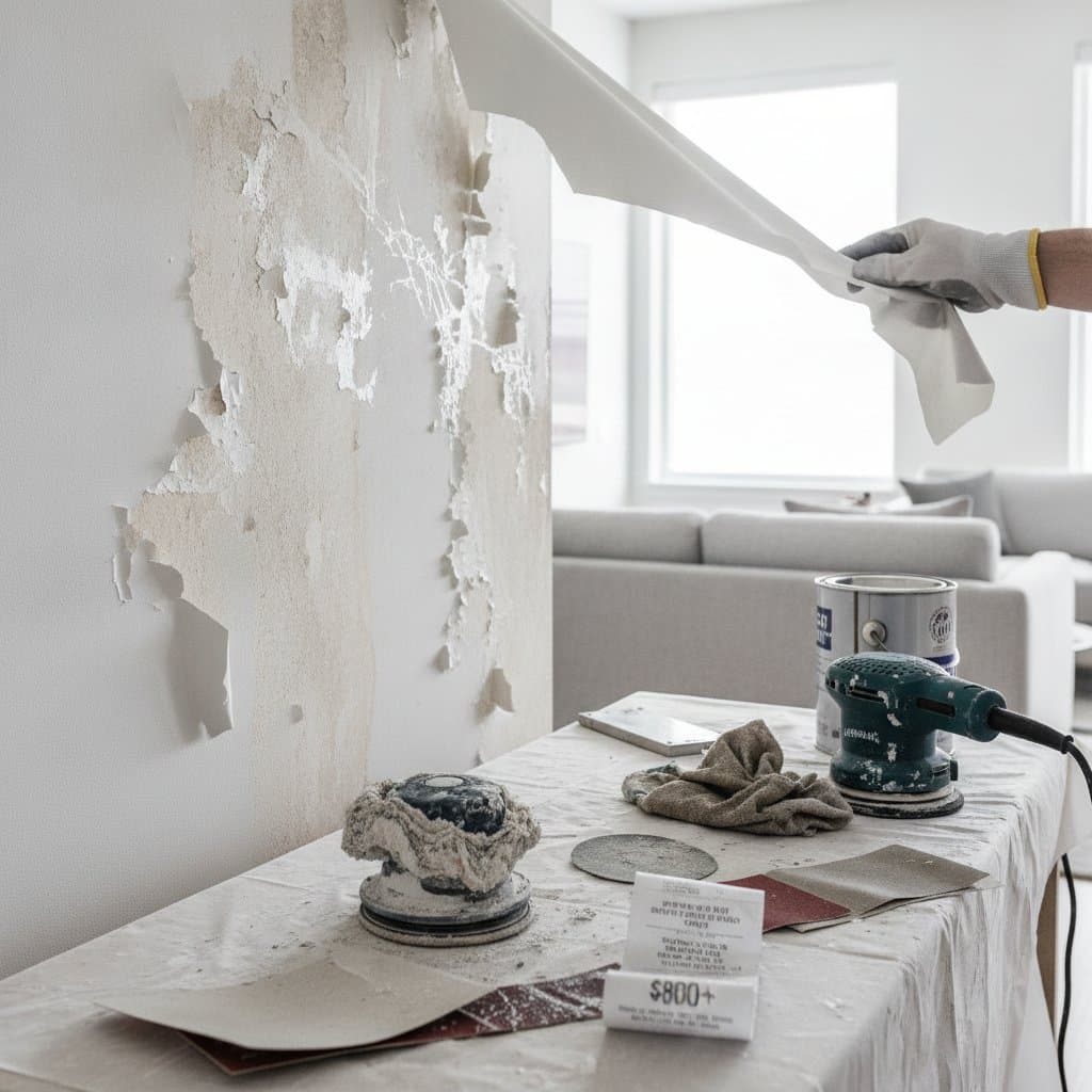
Budget Options and Smart Substitutions
Color matching at a local retailer remains the lowest-cost route. Present a printed swatch or digital reference for scanning and mixing. Test the resulting sample on the target wall under multiple lighting conditions before full application.
Mid-range selections from Sherwin-Williams or Behr improve coverage and durability without substantial price increases. Higher-end lines such as Benjamin Moore Aura supply richer pigment and greater scrubbability for high-traffic surfaces.
A satin or matte clear coat applied over a standard formula adds protection at lower cost than upgrading the entire product line.
How to Use Mocha Mousse in Real Life
The color gains impact through contrast and texture. The following applications demonstrate effective placement.
Living rooms benefit from Mocha Mousse walls paired with creamy trim and woven textiles. Brushed brass or matte black hardware introduces a modern accent.
Bedrooms gain calm when the shade appears behind the headboard. Linen bedding in ivory and stone tones, combined with walnut or rattan accents, completes the scheme.
Kitchens receive grounding when lower cabinets receive the color and upper cabinets remain white. Butcher-block countertops reinforce the warm tone.
Bathrooms achieve a spa effect through combination with white tile and soft gold hardware. Exterior trim applications work against cream or sage siding to add subtle depth.
Lighting and Finish Tips
North-facing rooms render the color as an elegant taupe. South-facing rooms introduce gentle caramel warmth. Two coats applied to a poster board allow evaluation throughout the day in the actual space.
Matte or eggshell finishes emphasize the velvety surface indoors. Satin finishes suit kitchens and bathrooms that require frequent cleaning. Semi-gloss trim provides crisp contrast against the main color.
Pairing Colors That Sing Together
Mocha Mousse coordinates with several palettes. Soft neutrals such as cream, ivory, and pale sand produce timeless calm. Earth tones including olive, rust, and terracotta add depth. Cool companions such as dusty blue or misty green create serenity. Bold accents of black, navy, or mustard yellow supply energy when desired.
Applying These Principles in Your Space
Once applied, the color evolves with seasonal textiles. White linen refreshes the room in summer while charcoal wool maintains balance in winter. Touch-up paint stored in sealed containers allows quick correction of minor marks. The neutral base supports future palette changes without requiring complete repainting.