Boost Home Value by 12 Percent with 2026 Dopamine Colors
Homeowners seek ways to enhance both living spaces and financial returns. Designers, realtors, and color experts confirm that a strategic paint palette can increase resale value by up to twelve percent. The emerging 2026 dopamine colors emphasize joy, optimism, and personality, transforming interiors into vibrant assets.
These hues extend beyond trends; they convey confidence, creativity, and connection. Prospective buyers prefer homes that exude vitality rather than neutrality. Painting an accent wall or updating the exterior with these colors distinguishes a property, accelerates sales, and improves daily living experiences.
Defining Dopamine Colors
Dopamine colors evoke positive emotions such as excitement, comfort, or serenity. These tones stimulate the brain positively, fostering an uplifting environment. In 2026, dopamine decor features vibrant yet balanced shades that elicit smiles upon entry.
Current selections include sunny yellows, coral pinks, mint greens, and warm apricots. These options blend nostalgic elements with contemporary vibrancy. Apply them judiciously to avoid overload; a harmonious combination yields dynamic, inviting spaces that capture light effectively for photography.
The Psychology and Impact of Color on Perception
Color psychology demonstrates that specific shades affect mood and spatial perception. Brighter colors expand room appearances, enhance cleanliness, and promote activity. Softer variants encourage relaxation and coziness.
Real estate data indicates that properties with intentional color schemes sell more quickly and at premium prices. The dopamine strategy leverages this by incorporating targeted color accents over uniform neutrals. Examples include a coral entry door, butter-yellow kitchen elements, or mint accents in bathrooms, creating memorable impressions for viewers.
Key 2026 Dopamine Color Families
Explore prominent palettes suitable for various budgets and expertise levels. Each category offers versatile applications.
Sunny Optimists
These shades emit positive energy through buttercream, lemon zest, or warm honey tones. Ideal for kitchens, hallways, or entryways, they reflect light while maintaining subtlety.
- DIY Option: Apply a washable eggshell finish, such as Behr Sunlight Glow, to a single feature wall.
- Professional Mid-Range: Refresh an entire room with Benjamin Moore Golden Straw, complemented by matte black hardware.
- Luxury Studio Method: Integrate soft yellow walls with custom oak trim and warm LED lighting for an elegant radiance.
Playful Pinks
Evolved pinks deliver sophistication in coral, blush, and clay rose varieties. These add warmth and enhance room aesthetics.
- DIY Option: Revive furniture using Sherwin-Williams Rosy Outlook, suitable for renters seeking quick enhancements.
- Professional Mid-Range: Coat a powder room or office with Farrow & Ball Setting Plaster, accented by brass fixtures.
- Luxury Studio Method: Employ gradient pink walls alongside terrazzo flooring and white oak shelving for a refined ambiance.
Good Energy Greens
Greens evoke nature, with 2026 versions in minty and leafy tones symbolizing growth and abundance.
- DIY Option: Color planters or cabinet fronts with Valspar Spring Spirit.
- Professional Mid-Range: Install an accent wall in Dunn-Edwards Sage Wisdom for serene balance.
- Luxury Studio Method: Blend custom limewashed green with natural linen curtains and matte brass fixtures.
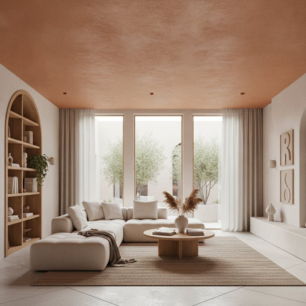
Cozy Corals and Apricots
These warm tones foster hospitality, glowing under varied lighting for comforting effects.
- DIY Option: Apply Behr Apricot Light to a breakfast nook.
- Professional Mid-Range: Update the front door with Sherwin-Williams Coral Clay for enhanced curb appeal.
- Luxury Studio Method: Utilize Venetian plaster in soft coral for textured, enduring elegance.
Placement Strategies for Optimal Impact
Selective application maximizes benefits without excess. Focus on elements that accentuate architecture or guide attention.
High-impact areas include:
- Front Door: Serves as the initial impression; a vibrant shade adds immediate allure.
- Kitchen Cabinets: Refreshed cabinets suggest modernity without major renovations.
- Bathrooms: Gentle tones transform compact areas into relaxing retreats.
- Accent Walls: A single bold surface sets the room's tone efficiently.
- Outdoor Trim: Contrasting trim against neutrals elevates overall refinement.
These choices ensure appealing visuals in photographs, boosting online listing engagement and sale speed.
Optimizing Colors for Visual Media
Colors interact uniquely with lighting, as observed in television and photography contexts. Intense illumination may dilute subtle shades, so select deeper pigments. Evaluate samples under site-specific conditions across daylight hours.
Employ satin finishes on walls for soft light reflection and matte on ceilings to minimize glare. This technique produces balanced, professional results in media captures.
Budgeting and Resource Strategies
Effective design accommodates all financial levels. Tailor approaches to circumstances, from rentals to resale preparations.
- Low Budget: Target small surfaces like doors or frames; utilize painter's tape and sample cans for testing.
- Mid Budget: Cover full rooms or cabinets; invest in superior brushes and rollers for efficient application.
- Higher Budget: Engage professionals skilled in layering and matching; they address imperfections pre-painting for superior outcomes.
Preparation remains essential: clean, sand, and prime surfaces. Proper groundwork ensures optimal color adhesion and appearance.
Ensuring Durability and Upkeep
Select resilient finishes to safeguard investments. Washable matte or satin suits high-traffic zones; semi-gloss excels in kitchens and bathrooms against wear.
For imminent sales, retain excess paint for maintenance. This practice maintains pristine conditions, appealing to future owners.
Color as a Strategic Asset
Color functions as both aesthetic and economic tool. A updated palette elevates market positioning, indicating meticulous upkeep. Developers and stagers prioritize consultations to yield substantial returns.
In product lines like furniture or textiles, these hues promote unity and appeal, aligning with demands for authenticity and optimism. Brands incorporating them in displays experience heightened consumer interaction.
Testing Colors Effectively
To confirm suitability, apply hues to poster boards and observe shifts in natural light. Assess compatibility with existing elements like flooring and furnishings.
Peel-and-stick samples provide commitment-free trials. Proceed confidently once validated; initial applications often reveal transformative potential.
Addressing Common Challenges
Projects encounter issues; proactive solutions maintain quality.
- Issue: Excessive Brightness Post-Drying. Solution: Introduce white curtains or neutral rugs for balance.
- Issue: Uneven Finish. Solution: Allow full drying between coats and maintain roller consistency.
- Issue: Color-Furniture Mismatch. Solution: Incorporate accessories like pillows or art in the new shade for cohesion.
Such tweaks preserve the intended vibrancy without extensive rework.
Embracing the Transformative Effects
With dopamine colors in place, observe mood enhancements in specific areas. Track guest reactions to refine further. Design adapts over time, potentially inspiring routines like cooking or productivity.
Upon selling, the refreshed aesthetic conveys care and readiness for transition. Buyers perceive inherent value in such energized environments. Select a hue and begin; each application builds toward a rewarding, elevated home.