Dusty Lavender and Mocha Redefine Neutral Paint Colors
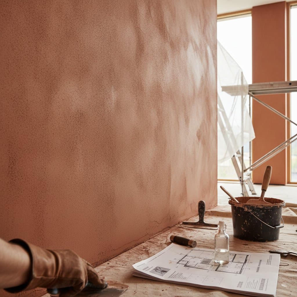
Dusty Lavender and Mocha form a fresh neutral pairing that brings warmth and subtle character to interiors. These shades move beyond standard whites and grays by adding calm depth without overwhelming a space. They suit many room types and lighting conditions while remaining versatile across design styles.
Core Qualities That Set These Neutrals Apart
Dusty Lavender offers a muted cool tone that stays sophisticated rather than sweet. Mocha supplies a creamy, grounded richness that feels natural and comforting. Together the colors create balance that flatters furniture finishes, artwork, and architectural details.
These hues perform consistently under varied light. They appear dimensional in daylight and retain softness under evening lamps, which reduces the risk of harsh shifts that can occur with stronger pigments.
Psychological Effects and Practical Benefits
Color psychology supports the appeal of this combination. Dusty Lavender blends the calm of blue tones with gentle warmth, promoting a tranquil yet creative atmosphere. Mocha evokes textures such as wool and wood, fostering a sense of security and comfort.
Used together the pair delivers emotional harmony. One shade encourages lightness while the other provides stability. This makes the palette suitable for homes, offices, and studios where both focus and relaxation matter.
Application Ideas for Key Rooms
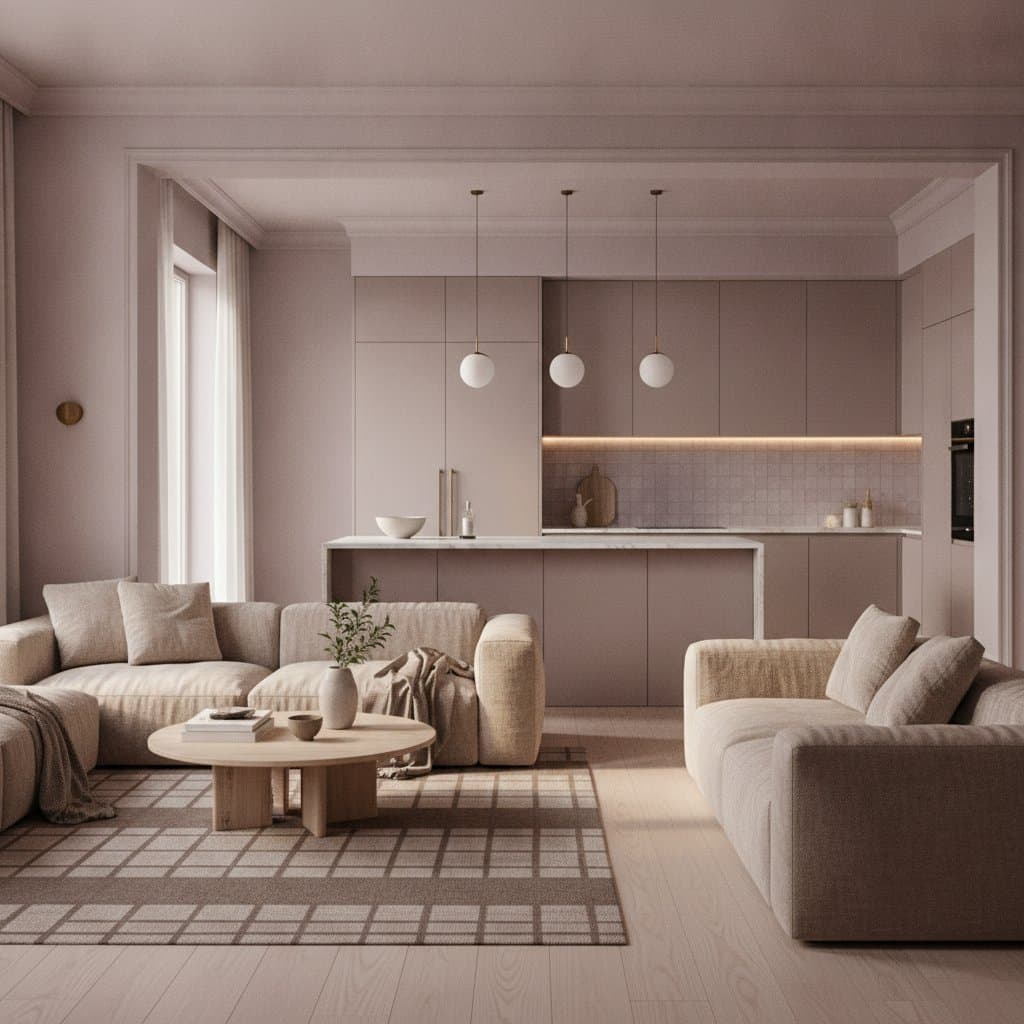
Living rooms gain effortless balance when walls receive Dusty Lavender and trim plus large furniture pieces stay in Mocha. The reverse approach works for cozier settings. Brushed brass or matte nickel accents add refined contrast.
Bedrooms benefit from Dusty Lavender on main walls paired with off-white bedding and natural linen. Mocha appears effectively on a headboard, woven rug, or accent wall. Renters can achieve similar results with large painted panels or removable wallpaper.
Kitchens pair Mocha cabinets with Dusty Lavender walls. Stainless steel, matte black, or copper hardware complements the scheme. A lower-budget option involves painting only base cabinets in Mocha while keeping upper cabinets white and adding a runner or stools in Dusty Lavender.
Bathrooms achieve spa-like calm with a Mocha vanity against Dusty Lavender walls. Natural stone counters keep the look grounded. An older mirror frame painted in lavender and updated towels in mocha tones provide an affordable refresh.
Home offices gain focus and imagination from Dusty Lavender walls. Mocha on shelving or a desk surface supplies contrast. Warm bulbs near Mocha surfaces and neutral white bulbs near lavender surfaces help maintain balanced appearance during video calls.
Budget Approaches
Low-budget updates include repainting one accent wall and adding thrifted Mocha accessories such as vases or frames. Fabric remnants can become throw pillow covers that incorporate both colors.
Mid-budget projects involve painting all walls in one shade and trim in the other. Replacement of hardware with brushed bronze finishes and addition of one custom art piece strengthen cohesion.
Higher-budget work includes refinishing cabinetry in Mocha or commissioning a mural that integrates Dusty Lavender gradients. Layered textiles such as velvet curtains and wool rugs complete the effect.
Material and Finish Recommendations
Natural woods including walnut and oak warm Dusty Lavender effectively. Brass, pewter, and soft gold metals enhance Mocha depth. Creamy marble, travertine, and matte porcelain tile maintain balance. Linen, velvet, and boucle fabrics keep the palette inviting.
Dusty Lavender reads best in matte or eggshell finishes. Mocha gains richness in satin or semi-gloss, especially on cabinetry. Self-priming formulas and primer tinted close to the final color reduce coats and improve consistency.
Photography and Maintenance Considerations
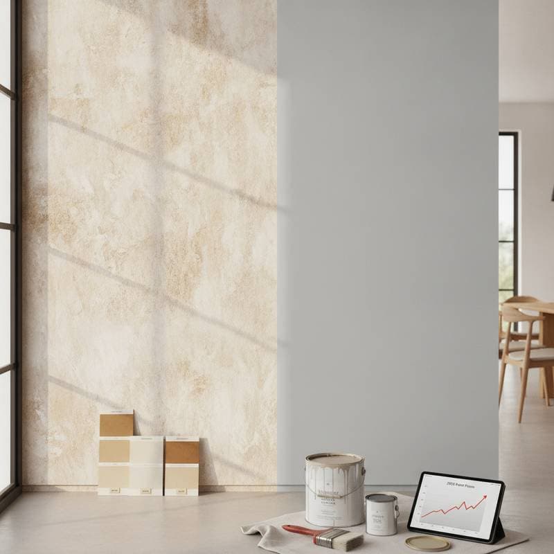
Both colors photograph cleanly without filters because muted undertones limit glare. Test samples on multiple walls under daylight and evening lighting before full commitment. Mocha deepens under warm bulbs while Dusty Lavender may cool slightly under LED sources.
Mid-tone colors conceal scuffs better than extremes. Eggshell or satin finishes suit high-traffic areas for easier cleaning. Flat finishes deliver a soft appearance in low-traffic rooms. Feather edges during touch-ups and store labeled leftover paint for seamless repairs.
Accent Pairings and Long-Term Adaptability
Charcoal or deep plum introduces drama. Ivory and misty gray maintain an airy feel. Mustard or sage green adds energy when used sparingly. Dusty Lavender serves as a strong backdrop for art collections because it flatters both warm and cool tones.
The palette adapts to evolving tastes. Swapping chrome accents for rattan or linen curtains for velvet changes the style story while the base remains elegant. This flexibility supports long-term satisfaction and reduces the need for frequent repaints.
Final Steps for Lasting Results
Always verify colors on site under actual conditions and mix sheen levels for added dimension. Quality tools and painter tape with clean release edges produce crisp lines. The resulting spaces feel calm, current, and personal while adapting gracefully to seasonal changes.