Understanding Dopamine Colors for 2026 Home Sales
Entering a space that evokes an immediate sense of joy highlights the influence of dopamine design. This approach leverages colors, textures, and patterns to generate happiness. In the current landscape, dopamine colors extend beyond aesthetics; they facilitate quicker home sales at premium prices.
Defining Dopamine Colors
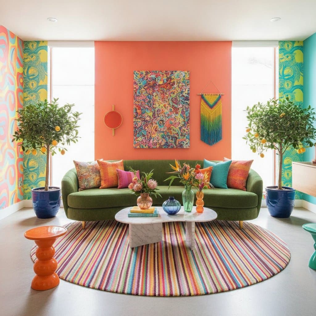
Dopamine colors function as mood enhancers applied to walls and surfaces. These include shades such as sunshine yellow, coral pink, or mint green that promote well-being. The concept stems from neurological responses to color, where specific tones release dopamine, the neurotransmitter associated with pleasure and motivation.
Such colors emphasize personal resonance over mere vibrancy. A subtle blush holds as much potential as a bold orange when it aligns with individual preferences. Buyers seek environments that evoke vitality, tranquility, or delight, and this emotional link accelerates sales.
The Role of Dopamine Design in Real Estate
Real estate transactions hinge on emotional responses. Buyers decide based on a property's ambiance. A dopamine-inspired palette delivers a lasting impression, instilling warmth upon entry.
This technique mirrors practices in media production. Vibrant colors excel in photographs, adding dimension and conveying intentional design. In actual viewings, these palettes render homes cheerful and hospitable, mirroring on-screen appeal.
Key Dopamine Colors and Strategic Applications
Examine prominent dopamine colors and their implementation for optimal sales impact.
Cheerful Yellows
Yellow conveys optimism and expansiveness. Apply soft butter tones in kitchens or breakfast nooks to amplify natural light and brighten compact areas. Repaint a single accent wall or kitchen island for an affordable enhancement, complemented by white trim for equilibrium.
Coral and Peach Tones
These hues impart warmth and accessibility. Employ them in living rooms or foyers for a welcoming yet sophisticated entry. Opt for matte finishes to achieve modernity or gloss for elegance, pairing with wood elements, rattan, or neutral fabrics.
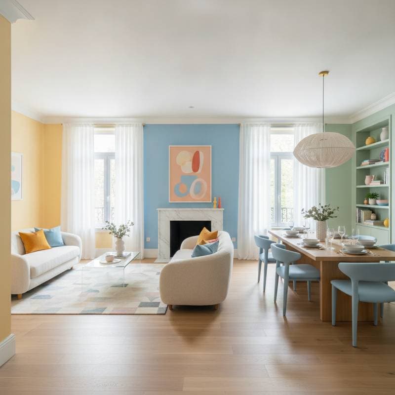
Soothing Blues
Blue embodies reassurance and versatility, appealing broadly. Powder blue suits bedrooms for restorative calm, while navy provides depth and assurance. These shades perform well in listing images, enhancing visual appeal.
Uplifting Greens
Green fosters a natural, rejuvenating atmosphere that resonates with buyers. Mint or sage offers serenity, whereas emerald or olive delivers richness. Incorporate plants alongside to suggest a complete, lifestyle-oriented setting.
Playful Pinks
Pink has evolved into a versatile, expressive choice. Blush variants serve as warm neutrals, harmonizing with gold or black details. Apply in compact areas like powder rooms or hallways to create engaging surprises.
Energizing Reds and Oranges
These colors capture attention effectively. Use terracotta in dining areas or bright red on exterior doors for immediate curb appeal. Limit application to avoid dominance, ensuring balanced energy.
Implementing Dopamine Design on a Budget
Achieve dopamine effects without extensive renovations through targeted updates. Consider these tiers for cost-effective transformations.
Low-Budget Approaches
- Replace textiles such as pillows, throws, and drapes to alter ambiance swiftly.
- Refresh furniture with paint; a coral coat on a dated piece costs minimal.
- Introduce artwork, including framed vibrant prints or custom abstracts, embracing personal imperfection.
Mid-Budget Strategies
- Target accent walls in dopamine shades to guide focus and enhance photography.
- Upgrade fixtures with warm lighting to intensify color vibrancy and coziness.
- Revamp cabinetry, applying cheerful tones to bases or islands for prominent impact.
Higher-Budget Transformations
- Engage professionals for full-room repaints, yielding uniform, renewed surfaces.
- Maintain color cohesion across elements like decor and art for seamless flow.
- Select advanced finishes such as tinted plaster or lacquer to elevate hues artistically.
Proven Techniques from Design Production
Insights from television design reveal methods for immediate visual success in sales.
- Balance bold colors with neutrals like white or gray to prevent overload.
- Prioritize entry views as the primary dopamine focal point.
- Incorporate textures such as velvet or linen to enrich color depth.
- Utilize large-scale items in dopamine tones for photographic prominence.
- Ensure open sightlines that direct gaze through color-guided paths, promoting fluid emotion.
Influencing Buyer Psychology Through Color
Color psychology shapes perceptions profoundly. Joyful environments signal value and readiness, boosting perceived appeal. Dopamine palettes convey vitality and positivity, with even minor accents differentiating listings.
Color families affect impressions as follows:
- Warm tones like yellow and coral evoke energy and sociability.
- Cool tones such as blue and green promote serenity and reliability.
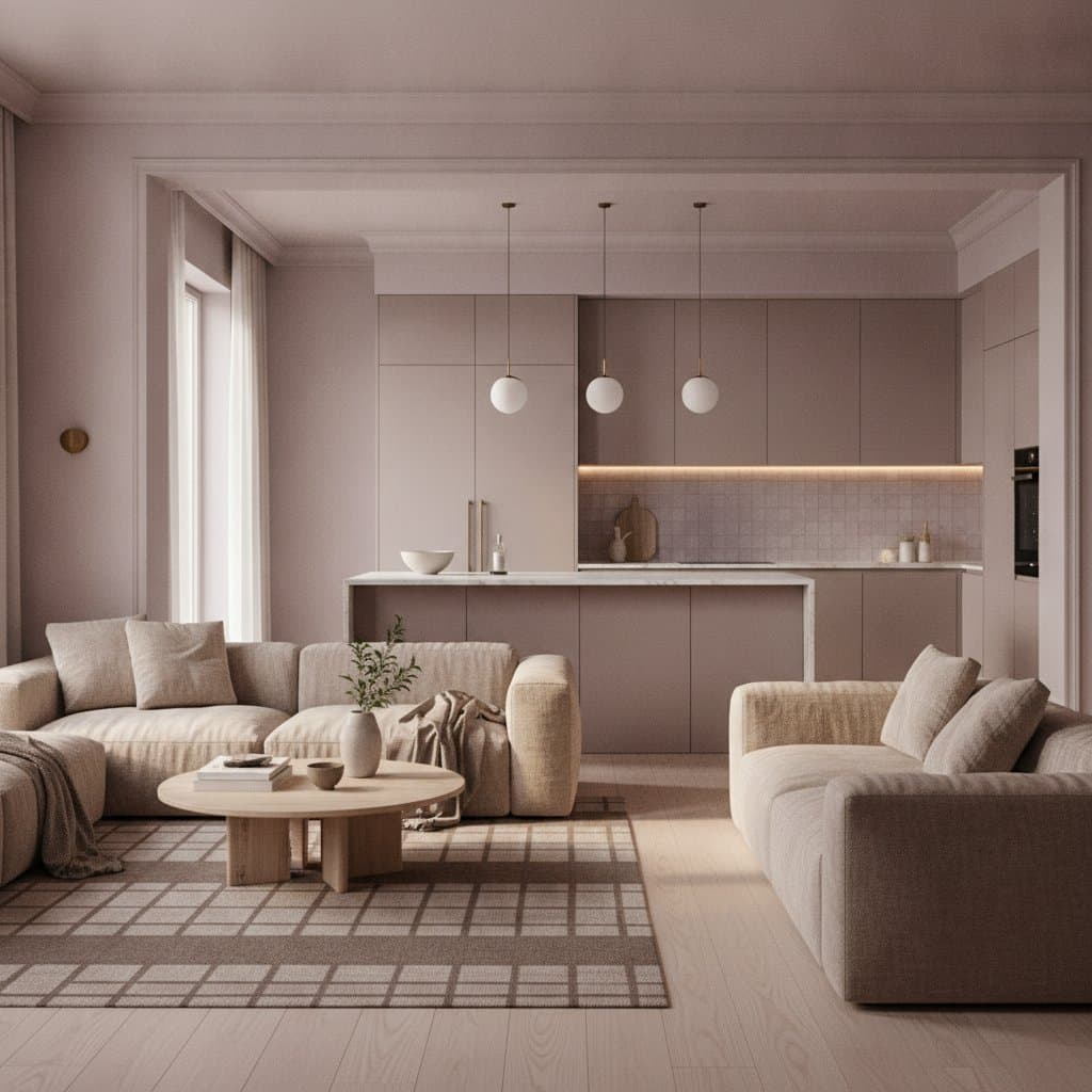
- Neutrals including white and beige clarify space and amplify accents.
Combining vibrant elements with subdued bases allows buyers to envision personal integration, blending excitement with comfort for swift decisions.
Strategic Color Choices in Real Estate Business
Design decisions carry financial implications for agents and owners. Paint upgrades offer high returns with low investment, altering perceptions of scale, illumination, and aesthetics to heighten interest.
From a professional perspective, dopamine approaches build loyalty. Satisfied clients promote successful outcomes, amplifying referrals. For painters and designers, distinctive palettes establish brand recognition through compelling transformations.
Testing Dopamine Color Selections
Initiate with small-scale trials before major applications. Apply samples to portable boards and observe variations across daily light conditions. Select shades that energize without dominating.
Simulate digital views by photographing through a device camera. Adjustments ensure colors translate authentically online, where initial buyer exposure occurs, maintaining lively yet genuine representation.
Aligning Dopamine Design with Lifestyle Shifts
Dopamine elements align with demands for expressive, wellness-oriented spaces. Homes evolve into supportive environments, and these colors enhance that dynamic.
Trends in apparel, appliances, and furnishings reflect this vibrancy, from patterned tiles to colorful accents. Such designs project authenticity and vitality, attracting buyers seeking uplifting residences.
Preserving Dopamine Color Vibrancy
Maintain vividness through proactive care.
- Select durable, low-VOC paints resistant to wear.
- Clean surfaces gently with mild solutions and soft tools.
- Refresh high-use zones periodically to sustain appeal.
- Mitigate sun damage with UV-protective films.
Consistent upkeep preserves the fresh, marketable essence.
Evolving Dopamine Designs
Adaptability defines dopamine design's strength. Transition bold shades with neutrals or complementary tones as preferences shift. Introduce accessories to modulate intensity while retaining joy.
For ongoing residents, these colors sustain daily positivity. For sellers, they generate magnetic appeal, converting viewings to commitments.
Essential Guidelines for Effective Implementation
- Ensure color continuity across adjacent areas.
- Align intensity with room proportions and lighting.
- Rely on intuitive appeal; personal joy often translates universally.
- Collaborate with skilled painters for flawless execution.
- Employ varied lighting layers to accentuate color strengths.
These practices unlock a home's inherent character with precise, joyful enhancement.
Embracing the Lasting Impact of Dopamine Colors
Dopamine colors embody optimism and relational design. They suit both market preparation and long-term habitation, fostering enhanced routines and pride.
Such palettes signal vitality to all entrants, prompting decisive buyer action. Select and apply these shades to cultivate spaces that inspire and succeed.