Biophilic Paint Colors for Wellness-Focused Interiors
Nature-inspired hues continue to shape interior design by supporting mental clarity and physical comfort. Biophilic paint colors draw directly from outdoor environments to foster these effects in residential and commercial spaces. These tones integrate science-based principles of color psychology with practical application across diverse budgets.
Defining Biophilic Paint Selection
Biophilic paint colors replicate the subtle variations found in natural settings, including moss greens, mineral blues, clay neutrals, and sand tones. Such shades lower perceived stress levels while promoting a grounded atmosphere. The approach emphasizes emotional response over literal replication of outdoor scenes.
These palettes suit multiple architectural styles, from compact urban apartments to expansive suburban homes. Homeowners achieve consistent results by selecting finishes that complement existing materials such as wood, stone, or textiles. Budget flexibility remains high because sample pots allow testing before full commitment.
Linking Color to Health Outcomes
Color psychology research shows that green hues encourage balance and sustained attention. Blue tones reduce heart rate and support mental clarity during focused tasks. Earth tones provide a sense of stability that benefits shared living areas.
Designers report that clients exhibit measurable relaxation when rooms receive these treatments. The same palettes translate effectively to video production and photography because they render evenly under varied lighting. This consistency supports both personal use and professional documentation needs.
Current Biophilic Color Categories
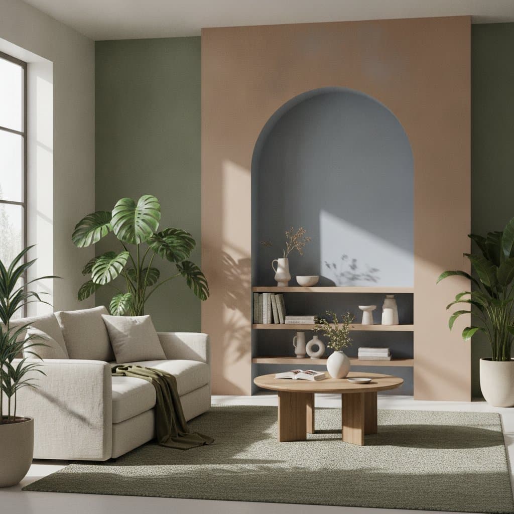
Forest greens range from pale fern to deep cypress and suit accent walls or cabinetry. Ocean blues appear in muted mineral variations that coordinate with metal hardware. Clay and terracotta neutrals pair with natural fibers for warmth in living spaces. Misty whites incorporate soft gray or taupe undertones to maintain brightness without harsh contrast.
Budget-Based Implementation Steps
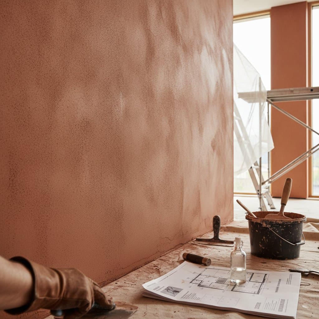
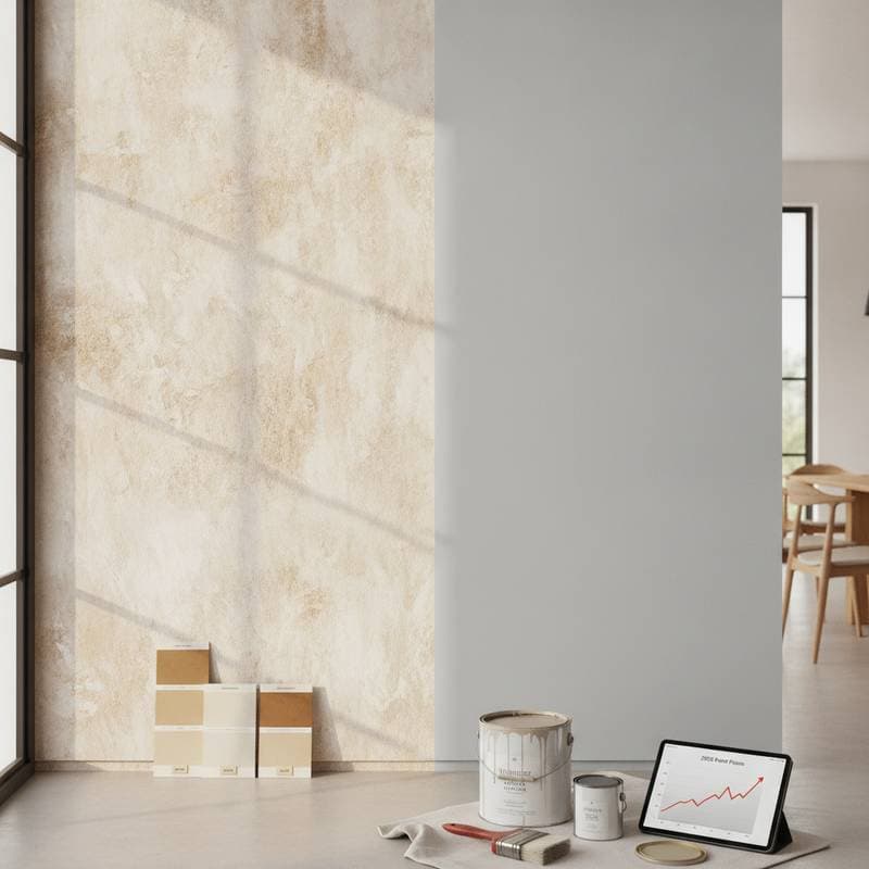
Low-budget projects begin with one feature wall or color-blocked sections behind furniture. Sample pots enable custom mixing to match local soil or foliage samples. Mid-budget updates apply coordinated shades across adjacent rooms and introduce texture through wainscoting or limewash. Higher-budget work incorporates zero-VOC formulations and professional plaster techniques for surface depth.
Room-Specific Applications
Bedrooms benefit from serene greens that support rest when paired with linen textiles. Living areas gain conversational warmth from clay tones combined with live plants. Kitchens use muted greens to highlight wood and stone surfaces. Bathrooms achieve a spa effect with mineral grays on walls and ceilings. Workspaces employ cooler blues behind desks to minimize eye fatigue.
Application Techniques for Depth
Limewash finishes introduce subtle movement across large surfaces. Ombre transitions blend adjacent tones to suggest natural gradients. Two-tone divisions separate lower and upper wall sections for visual balance. Extending color onto ceilings creates enclosure in smaller rooms without additional square footage.
Product and Service Extensions
Manufacturers align paint colors with matching textiles and case goods to create coordinated wellness collections. Builders offer packages that bundle low-emission paints with organic flooring options. These combinations deliver measurable value to clients seeking integrated health-focused renovations.
Finish Durability and Care
Matte surfaces provide organic appearance yet require careful cleaning. Eggshell and satin sheens balance aesthetics with resistance to daily wear. Scuff-resistant formulas maintain appearance in hallways and entryways after simple damp cloth maintenance.
Personal Palette Development
Individuals identify preferred tones by collecting outdoor references such as leaves or stones during local walks. Painted surfaces combine with jute rugs and reclaimed wood to maintain tactile variety. Plant placement at multiple heights completes the sensory connection.
Light Interaction Over Time
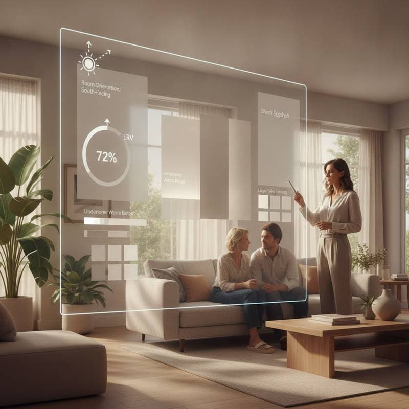
Morning illumination accentuates vibrancy in green and blue families. Evening light shifts earth tones toward warmer depths. This natural evolution prevents static appearance and supports long-term satisfaction with the chosen scheme.