Why Terracotta and Clay Pink Will Define 2026 Design Trends
Terracotta and clay pink represent warm, grounded shades that introduce comfort, connection, and inherent beauty into any environment. Positioned between earthy authenticity and refined elegance, these tones offer remarkable versatility. Designers, homeowners, and product developers increasingly recognize their ability to refresh spaces while maintaining a sense of humanity and enduring appeal.
This article examines the rapid ascent of these hues and provides guidance on incorporating them into residential or commercial settings, regardless of budget or expertise level.
The Photographic Appeal of These Shades
Warm mid-tones excel in visual media, a principle well-established in professional design. Terracotta and clay pink perform exceptionally under both natural and artificial lighting conditions. They convey rich color without excessive glare and enhance skin tones for a flattering effect. Consequently, designers favor these shades for television sets, product packaging, and social media imagery, where authenticity and approachability matter.
For spaces intended for photography or video promotion, these hues provide ideal depth without dominance. Opt for matte finishes to ensure soft light diffusion and an welcoming atmosphere. An accent wall in terracotta, for instance, prepares any room for professional capture with minimal effort.
Incorporating These Hues Across Budget Ranges
Incorporating terracotta and clay pink requires no substantial investment to achieve impactful results. The following outlines strategies for various spending levels.
Low or no budget options:
A single gallon of high-quality wall paint can revitalize a room dramatically. Apply terracotta to an accent wall or clay pink to a recessed area for focused impact. Renters may prefer removable wallpaper or fabric panels in these shades, which deliver comparable ambiance without permanent alterations.
Moderate budget approaches:
Introduce textiles and lighting elements to elevate the mood. Select a terracotta linen throw blanket, a clay pink lamp shade, or curtains in complementary clay tones. Pair these with cushions in warm neutrals to create a unified scheme.
Higher budget investments:
Explore custom millwork or tiling in these colors for lasting sophistication. Terracotta tile backsplashes, pink clay plaster walls, or powder-coated metal accents in matching hues offer durable elegance. Such enhancements retain value over time and maintain strong visual performance in images.
Across all levels, maintain consistent warm undertones to produce a polished, professional appearance.
Current Applications by Professional Designers
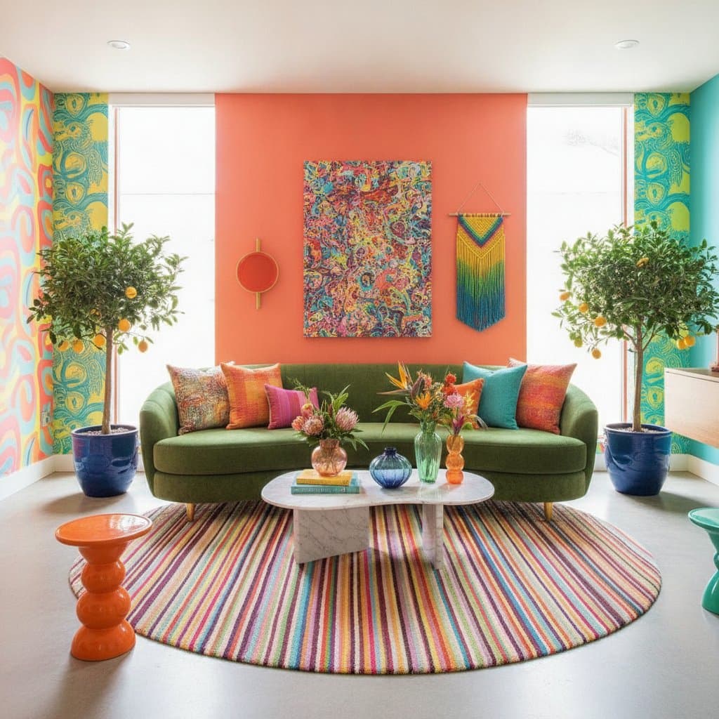
These colors appear across diverse projects, from upscale hotels to innovative studios. Designers often apply soft clay pink to entire rooms, creating an enveloping, serene atmosphere. Alternatively, terracotta walls paired with crisp white ceilings and black trim yield striking contrast.
In set design, these tones evoke immediate warmth and genuineness, making staged environments feel inhabited and emotionally resonant. Retail spaces incorporate terracotta into display plinths and signage, capitalizing on its organic, stable presence.
A notable example from recent work involves a clay pink ceiling combined with terracotta baseboards. This reversal of traditional color placement introduces a playful yet contemporary dynamic.
Pairing with Neutrals and Accent Elements
As members of the warm neutral spectrum, terracotta and clay pink harmonize with a broad array of palettes. Consider these pairing strategies for optimal results.
- With whites: Select creamy or ivory variations to preserve warmth; stark white may introduce unintended coolness.
- With other neutrals: Combine with camel, mushroom, or taupe to build subtle layers of depth.
- With deeper tones: Introduce olive green, charcoal, or deep navy for added drama and balance.
- With metallics: Brass and copper amplify the inherent warmth, whereas brushed steel provides effective contrast.
For an eclectic approach, incorporate patterns inspired by natural motifs, such as terracotta-inspired florals, geometric designs in clay hues, or woven textures with tribal influences. These elements blend seamlessly without dominating the composition.
Sustaining and Evolving Your Design Choices
After integrating terracotta and clay pink, these hues continue to enhance living spaces over time. Exposure to sunlight gradually enriches their patina, and they adapt readily to updates in furniture or artwork. To adjust the atmosphere, modify accessories accordingly; incorporate fresh greens for vitality or metallics for refinement.
Renters benefit from movable items like painted folding screens, throw pillows in clay tones, or terracotta planters, ensuring flexibility. Homeowners may pursue more ambitious features, such as comprehensive wall treatments or color-blocked cabinetry. Notably, these colors transcend transient trends, anchoring environments in enduring comfort and inventive expression.
Effective design remains accessible to all. Whether refreshing a single wall over a weekend or overseeing a complete interior overhaul, terracotta and clay pink infuse spaces with joy, warmth, and lasting allure. They demonstrate that earthy foundations can support elegant forms, and gentle shades can convey resilient strength. Prepare to embrace these tones and experience their daily welcoming presence.