Why Testing Paint in Three Lighting Conditions Leads to Perfect Results
Selecting a paint color appears straightforward until the application reveals an unexpected outcome. Savvy homeowners recognize that color perception depends heavily on surrounding light. The same shade may appear vibrant and welcoming in one setting but flat or mismatched in another. By testing paint samples under three distinct lighting conditions, individuals avoid the expense and effort of repainting, ensuring a selection that performs consistently throughout the day.
This practice uncovers how light influences undertones and overall appearance, leading to choices that enhance room aesthetics and integrate seamlessly with existing elements. Homeowners who invest time in this evaluation report higher satisfaction with their interiors, as the method accounts for real-world variables that influence color.
Understanding Light's Impact on Paint Colors
Light serves as the primary factor in how humans perceive color, with each source altering hues in unique ways. Natural daylight provides a balanced view but shifts based on time, direction, and weather. For instance, a soft beige might glow warmly under direct morning sun yet seem stark under overcast skies.
Artificial lighting introduces further variations. Incandescent bulbs emit a yellowish warmth that can enrich earth tones but wash out cooler shades. In contrast, fluorescent or LED options often deliver a crisp, blue-tinted illumination that sharpens contrasts yet may drain vibrancy from reds and yellows. Evening conditions, combining fading natural light with indoor fixtures, can deepen shadows and intensify certain colors, such as turning a neutral gray into a moody charcoal.
By examining these interactions, homeowners gain insight into a color's behavior across daily cycles. This knowledge prevents surprises and supports decisions that maintain visual harmony from dawn until dusk. Testing reveals not only surface changes but also how paint interacts with room architecture and materials.
Essential Lighting Tests for Accurate Color Evaluation
Professional painters and design experts recommend evaluating paint in three targeted lighting scenarios to capture a comprehensive picture. Each test focuses on prevalent daily conditions, allowing for predictions about long-term appearance.
-
Morning and Midday Natural Light
Position samples where direct sunlight enters, typically from south- or west-facing windows. This bright, even illumination highlights a color's purest form, emphasizing warm undertones in south-facing spaces that receive golden rays. North-facing areas, bathed in softer, diffused light, may cause warm hues to appear subdued, making this test crucial for identifying potential dullness. -
Afternoon and Evening Natural Light
As daylight transitions, observe how shifting angles affect the samples. Lower sun positions cast longer shadows and warmer tones, potentially transforming a crisp white into a creamy ivory or adding depth to greens. This evaluation proves vital for rooms used in the late day, ensuring colors retain energy without becoming overly saturated or faded. -
Artificial Indoor Lighting
Activate all room fixtures after dark to simulate nighttime use. Experiment with bulb types: warm LEDs might enhance cozy atmospheres for living areas, while cool fluorescents suit task-oriented kitchens. Note how overhead lights create even coverage versus the directional glow of lamps, which can spotlight undertones like hidden pinks in supposedly neutral shades.
These tests, conducted over multiple days, provide a dynamic view of color performance. Homeowners often discover that initial favorites falter under one condition, guiding refinements for optimal results.
Detailed Guide to Testing Paint Samples Effectively
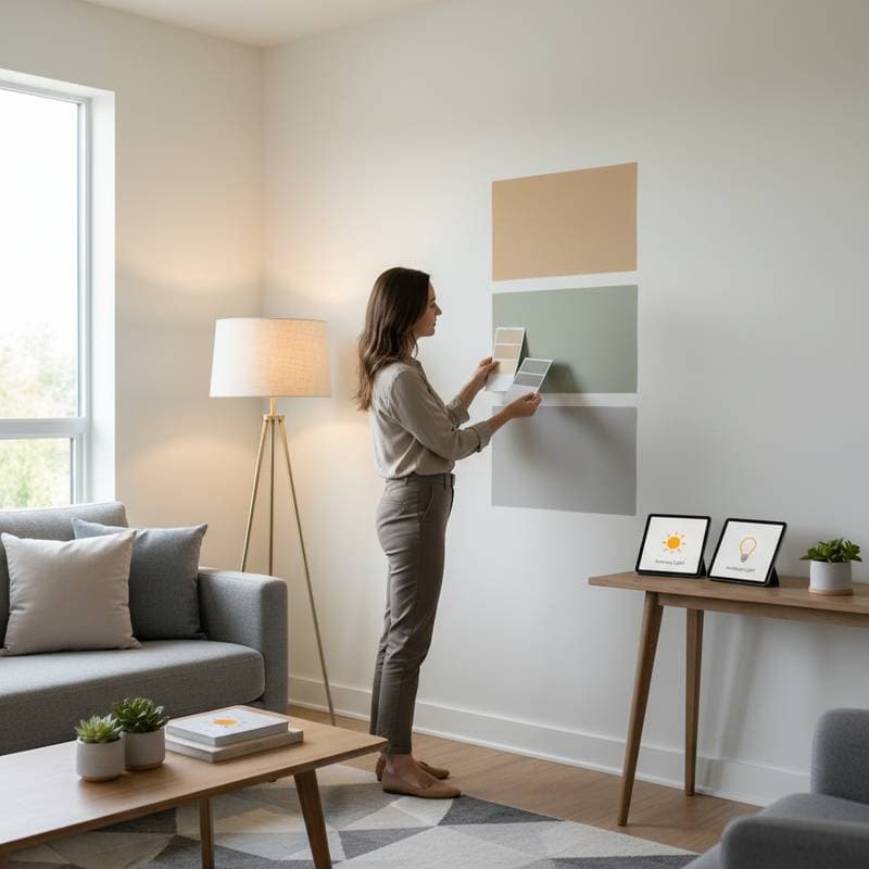
A structured approach maximizes the benefits of lighting tests, turning guesswork into precision. Begin by gathering supplies: small cans of sample paint in shades adjacent to your target color, brushes, and painter's tape for clean edges.
Next, apply generous swatches—at minimum two feet square—on walls facing different directions within the room. This size allows observation from various angles and distances, mimicking the full wall effect. Clearly label each patch with the color name and date to avoid confusion during repeated viewings.
Over the following three to five days, revisit the samples at set intervals: early morning, peak afternoon, and evening hours. Switch between natural and artificial sources, noting changes in mood and compatibility with nearby items like upholstery or rugs. Take photographs under each condition for side-by-side comparisons, especially useful for sharing with family or designers.
Incorporate the room's fixed elements during assessments. Drape fabrics or place decor nearby to check for clashing reflections. If possible, test on both primed and unprimed surfaces, as primers can subtly shift final tones. This thorough process exposes nuances, such as how a matte finish diffuses light differently than gloss, influencing perceived depth.
The Financial and Practical Benefits of Pre-Application Testing
Undertaking these tests upfront safeguards against common pitfalls that lead to rework. A mismatched color often necessitates stripping and repainting, escalating costs by 50 percent or more due to additional labor and materials. In a standard 12-by-12-foot room, this could add hundreds of dollars to the project.
Beyond finances, testing preserves time and reduces stress. Professionals estimate that 30 percent of painting jobs involve color adjustments, delaying completion and disrupting household routines. By confirming selections early, homeowners proceed with assurance, aligning the outcome with personal style and functional needs.
This proactive step also enhances property value. Well-chosen colors contribute to appealing interiors that attract buyers, as studies from real estate associations indicate harmonious palettes increase perceived home quality. Ultimately, the investment in samples—typically under 50 dollars—yields returns through durable, enjoyable spaces.
Achieving Enduring Color Harmony in Your Home
Integrating tested colors elevates everyday living by creating cohesive environments. Consider consulting a color wheel to balance warm and cool tones across adjacent rooms, preventing jarring transitions. For multi-room projects, apply the three-light method consistently to maintain flow.
Experiment with accent walls to introduce variety without overwhelming the palette. Pair tested neutrals with bolder hues observed under similar conditions for layered interest. Over time, revisit selections seasonally, as furniture changes or renovations may warrant refreshes using the same reliable testing protocol.
Homeowners who adopt this method report transformed spaces that feel intentional and inviting. The result stands as a testament to informed choices, fostering pride in personalized designs that withstand the test of time and light.
Frequently Asked Questions
Why Do Paint Colors Appear Different During the Day and at Night?
Paint reflects wavelengths from light sources in varying ways. Daylight offers a full spectrum that reveals balanced hues, whereas artificial lights filter specific tones, introducing warmth or coolness that shifts perceptions.
How Large Should Paint Test Areas Be?
Create patches at least two feet wide and tall for realistic evaluation. Such dimensions capture light interactions across a meaningful surface, providing insights unattainable from small cards or digital images.
Can Digital Color Previews Replace Physical Paint Testing?
Digital tools assist in initial screening but fall short of physical accuracy. Screens cannot duplicate wall textures, ambient reflections, or precise lighting, which all influence final outcomes.
What Type of Lighting Provides the Most Accurate Paint Assessment?
Neutral daylight or 4000K white LED bulbs deliver the truest representation. Steer clear of colored filters during core testing to isolate the paint's inherent qualities without distortion.
How Long Must One Observe Paint Samples Before Finalizing a Choice?
Allow three to five days for comprehensive viewing across lighting variations. This duration accounts for weather fluctuations and usage patterns, ensuring a well-rounded decision.
Should One Test Paint Finishes Alongside Colors?
Absolutely, as finishes alter light reflection significantly. Satin sheens amplify brightness in low-light areas, while flat options absorb it for subtler effects; testing both secures the desired ambiance.


