2026 Dopamine Colors: Increase Joy by 30 Percent in Your Home
Dopamine decor emphasizes joy through vibrant elements. It highlights color, vitality, and the principle that surroundings influence emotions. Consider entering a space that immediately elevates mood, prompts a smile, and evokes brightness and playfulness. Such is the influence of dopamine colors in interior design. These choices extend beyond fleeting trends to promote emotional well-being via paint, texture, and illumination.
Understanding Dopamine Colors
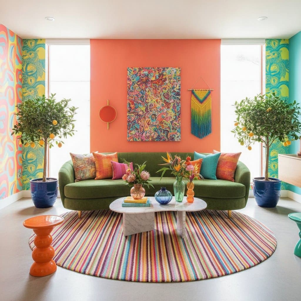
Dopamine colors consist of uplifting shades that trigger positive emotional reactions. View them as a form of color therapy that remains engaging and aesthetically pleasing. These tones evoke the thrill of laughter, renewal, or the initial taste of morning coffee. They appear in rich, pastel, saturated, or subdued variations, provided they instill a sense of vitality.
The selection encompasses hues such as vivid coral, refreshing mint aqua, radiant sunflower yellow, dynamic electric lavender, and smooth creamy peach. Effectiveness arises from purposeful application. Opt for full saturation or integrate with neutral tones for equilibrium. The objective involves generating joy without disorder and energy without excess.
The Science Behind Joyful Hues
Color psychology indicates that specific shades activate dopamine, the neurotransmitter associated with pleasure. Warm reds and oranges provide stimulation. Blues and greens offer calm and renewal. Yellows and pinks promote uplift and optimism. Thoughtful combinations convert a residence into a source of sustained happiness.
In design applications, dopamine colors interact effectively with lighting. They capture natural light, intensify it, and expand perceived space while enhancing appeal. In photography or video, these shades convey liveliness and contemporaneity, which accounts for their popularity among television designers and stylists. A bright tone ensures immediate visual impact even under tight schedules.
Selecting Your Dopamine Palette
Begin with personal intuition. Identify colors that elicit a smile. Consider shades linked to cherished memories, such as a vacation or shared meal with companions. These serve as indicators for your palette.
Follow this structured approach:
-
Initiate modestly. Experiment with one wall, a single furniture item, or an isolated accent area. Apply paint samples to poster board and observe variations under different lighting conditions.
-
Prioritize harmony over uniformity. Dopamine design flourishes with contrast and unexpected elements. Pair cool tones with warm ones, matte surfaces with glossy, or gentle shades with intense.
-
Incorporate texture. Position a glossy coral cabinet adjacent to a matte cream wall to build depth and interest. Texture prevents colors from appearing monotonous or imposed.
-
Rely on emotional response. A color succeeds if it generates happiness.
Budget Levels for Dopamine Implementation
Achieve dopamine decor across various financial ranges.
Low-Cost Options: DIY and Repurposing
- Repaint salvaged frames in vibrant shades.
- Apply peel-and-stick wallpaper or decals featuring tropical motifs.
- Utilize surplus paint for color-blocking shelves or door edges.
- Transform fabric scraps into artwork panels or cushion covers.
Moderate Investment: Targeted Updates
- Select one prominent accent wall in a frequently used space.
- Swap cabinet hardware for brightly powder-coated versions.
- Integrate colorful pendant fixtures or counter stools.
- Coat interior doors in surprising tones like aqua or tangerine.
Premium Choices: Bespoke Enhancements
- Engage a local artist for a custom mural inspired by dopamine themes.
- Install tailored cabinetry with dual-tone applications.
- Employ professional painters for intricate color blocking or gradient effects.
- Express personal identity through color as a signature home feature.
Each tier yields joy, differentiated by extent and longevity.
Room-Specific Applications
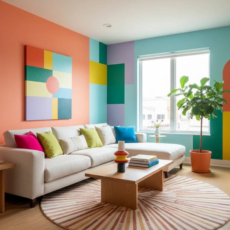
Living Room: Introduce coral, warm pink, or golden yellow to foster warmth and social vibrancy. Balance with creamy neutrals.
Kitchen: Employ mint green, lemon, or robin's-egg blue to make meal preparation enjoyable and invigorating. These hues complement natural light and glossy surfaces.
Bedroom: Choose serene dopamine options like lavender, powder blue, or buttery beige accented by terracotta. Maintain softness with joyful undertones.
Bathroom: Select apricot or soft aqua to illuminate compact areas and maximize light reflection.
Office or Studio: Utilize cobalt blue or vivid chartreuse to heighten concentration and innovation. Pair with crisp whites or light gray for precision.
Optimizing for Visual Media
Experience from design productions reveals that dopamine colors captivate on camera. Devices favor contrast and definition. A bold peach wall against neutral furnishings creates striking prominence. Glossy finishes capture highlights, whereas matte paints minimize reflections. Assess colors under daylight and artificial sources, as tones may alter.
For social platforms or branding imagery, dopamine colors project assurance and positivity. They attract attention rapidly and encourage sharing. This trend explains the shift in product lines, from furnishings to paints, toward such palettes.
Professional Painting Techniques
-
Prepare thoroughly. Clean surfaces, apply painter's tape precisely, and sand gently for even adhesion.
-
Prime effectively. Vibrant colors require white or tinted primer to avoid muted results.
-
Apply in layers. Use two to three thin coats rather than a single thick application.
-
Evaluate under varied light. Review shades during morning, midday, and evening to ensure uniformity.
-
Protect finishes. In areas of frequent contact, apply a clear topcoat or durable washable formula.
Skilled application emphasizes precision. Clean lines and smooth surfaces amplify the vibrancy of dopamine designs.
Business Perspectives on Color Strategy
Design professionals and residents leverage dopamine decor for innovation and commerce. Paint manufacturers broaden hue assortments. Furniture producers introduce limited-edition colors. Local businesses partner with artists for vibrant installations.
Entrepreneurs link emotional health to spatial design. Demand exists for residences that embody positivity and endurance. Providing palettes that evoke these qualities fosters client loyalty and ongoing engagements.
For business or rental applications, experiment with color to enhance appeal.
Low-Risk Testing Methods
Validate color choices through minimal commitments:
- Coat the interior of a closet or cabinet with a bold shade.
- Install removable wallpaper on a single wall.
- Use colorful grout with white tiles for subtle playfulness.
- Paint chair legs or frame edges prior to full-wall projects.
Expand favored hues incrementally upon confirmation. Emphasize liberty without apprehension.
Sustaining Dopamine Designs
Integrating dopamine colors leads to noticeable mood and energy improvements. Morning routines become more pleasant. Daily tasks feel less burdensome. Visitors remark on the cheerful atmosphere.
Preserve surfaces with gentle cleaning and accessible touch-up paint. Periodically update accents or accessories to maintain balance. Dopamine design adapts flexibly to life changes.
Should overstimulation occur, incorporate neutrals like cream, soft gray, or light wood for respite. Equilibrium ensures lasting joy.
Essential Strategies for Optimal Results
- Align surface treatments. Gloss, matte, and satin finishes harmonize when placed intentionally.
- Consider furniture proportions. Vibrant walls pair best with uncomplicated forms, allowing color to dominate.
- Manage illumination layers. Warm bulbs accentuate dopamine tones, while cool ones may diminish them.
- Record color details. Store paint swatches or digital codes for reliable maintenance.
- Follow intuition. Joyful sensations confirm success.
Effective design remains accessible to all, regardless of budget or expertise. Dopamine colors demonstrate that happiness emerges through intentional painting and styling.
Select tools, sample shades, and infuse spaces with delight. A positive environment represents ultimate refinement, attainable for any residence and individual.